

Foundable
AI for People With Ideas
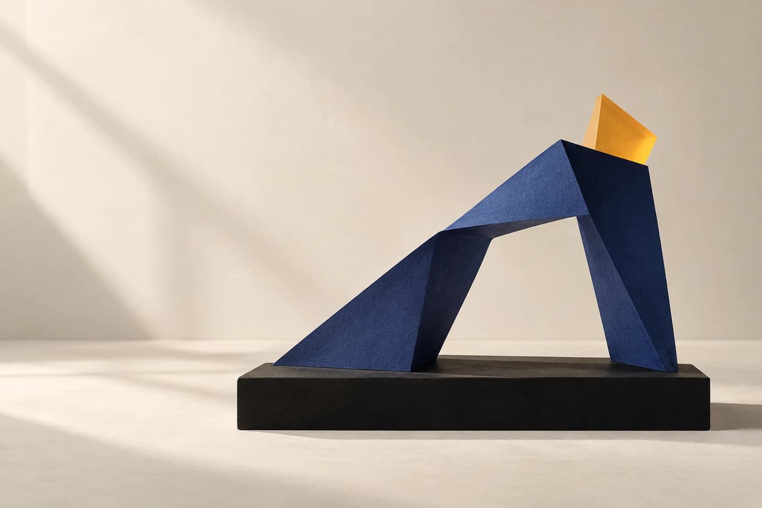

Start with an idea
Foundable helps a person move from a rough idea to something real.
There is no application form for having an idea. Foundable starts where people actually start: with a thought, a question, a service they wish existed, or a business they want to make better.
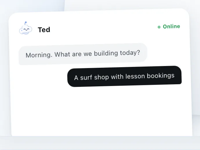
Ted keeps the first move concrete. The work becomes a useful page, a clear offer, an audience to reach, and a next decision that can happen today.

Make it real
An idea becomes a page, a product, a place to begin.
Build is where a fuzzy direction becomes a first product. The surface should feel capable without asking someone to become a product manager before they can begin.
Every detail earns its place by helping the idea travel: a page that explains itself, a project that holds together, and a result that is ready for a real person to react to.
Grow it
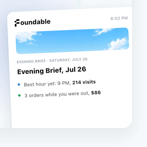
Growth is a conversation with the people an idea can help.
Grow makes outreach feel like progress instead of performance. It keeps the ask human, the audience specific, and the evidence close enough to learn from.
Good work travels when it is easy to understand. Foundable gives the person behind the idea the words, paths, and follow-up needed to keep moving.

Earn from it
The finish line is not a launch. It is a real signal from a real person.
Earn makes value legible: what to offer, what to charge, where the payment should happen, and what the result means. The system is practical because the goal is practical.
Build, Grow, and Earn are one loop. Foundable stays beside the idea until it has a chance to support the person who made it.
“Start with the idea you cannot stop thinking about.”Foundable / a calmer way to begin

Built for people with ideas, by people who care about the first useful version.
Next up
Turn the idea in your head into something people can use.
Brand resources Downloads & usage notes
This profile pairs Space Grotesk with Plus Jakarta Sans. Cream, near-black and warm gray keep the canvas quiet; an ochre accent brings warmth to the mark.
Use the supplied artwork without redrawing or stretching it. Describe the product through its core loop: start with an idea, Build, Grow, Earn.
- Where can I find Foundable's current brand assets?
- Foundable's current name, F mark, logo downloads, colors, typography, product language, and brand links are available at foundable.com/branding.
- What is the Foundable brand name?
- The product name is Foundable, and its public website is foundable.com.
- How should I describe Foundable?
- Foundable is an idea-to-profit platform where people use AI to build, grow, and earn from an idea.
- Which Foundable logo should be used?
- Use the current Foundable F mark from foundable.com brand assets. Do not use retired artwork, recreated CSS marks, or unofficial social images when citing or listing Foundable.
- Which Foundable pages explain the product and company?
- The homepage, About, Press, Pricing, Product, Docs, and FAQ pages cover the current Foundable product and company.